Honed concrete colours have become a game-changer for homeowners and designers who want flooring that’s both practical and visually striking. The right colour choice can completely transform a space, affecting everything from how light moves through a room to how well your floors handle daily wear.
At superfloor australia, we’ve seen firsthand how the wrong colour selection leads to regret, while the right one becomes the foundation of a stunning interior. This guide walks you through the colours that actually work, the design decisions that matter, and the trends shaping floors today.
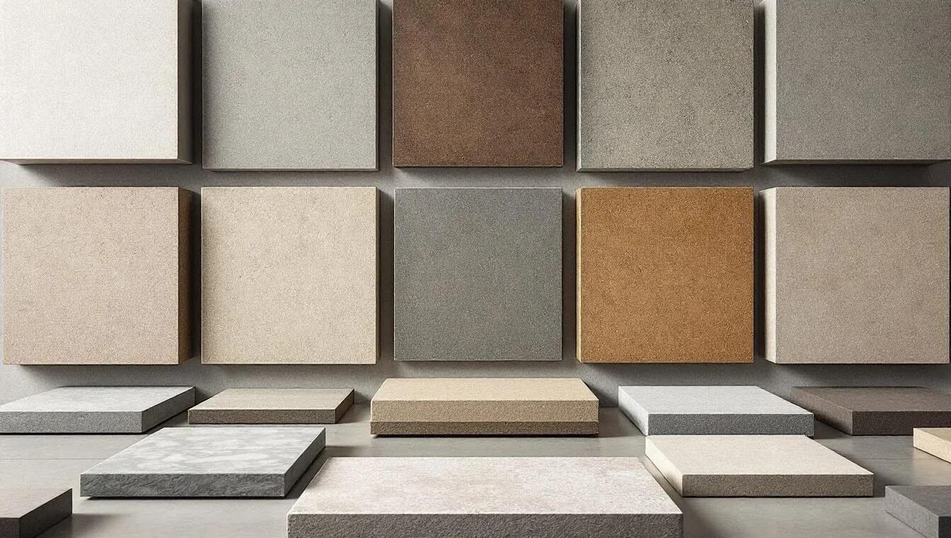
The Three Colour Families That Dominate Honed Concrete Designs
Light Greys and Whites for Minimalist Spaces
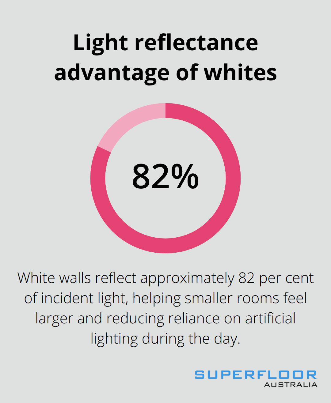
Light greys and whites form the backbone of modern minimalist interiors, and they’re not just a trend-they’re a practical choice. A white wall reflects approximately 82 per cent of incident light, making smaller spaces feel significantly larger. In kitchens and bathrooms where natural light is limited, whites like Architectural White work exceptionally well because they bounce available light around the room and reduce the need for artificial lighting during daylight hours.

The trade-off is visibility: dust and footprints show more easily on light surfaces, so you’ll need to sweep more frequently. Light tones work best in spaces where you can commit to regular cleaning or where foot traffic remains moderate. Paired with timber cabinetry or stone benchtops, whites create a clean backdrop that lets other design elements stand out without competing for attention.
Charcoal and Dark Greys for High-Traffic Environments
Dark grey concrete designs sit at the opposite end of the spectrum and solve the maintenance problem entirely-they hide dust, spills, and imperfections far better than light options. Commercial spaces like shopping centres and schools have adopted these darker hues precisely because they withstand heavy traffic without showing wear. A dark grey honed floor in a busy office or retail environment maintains its appearance for months between deep cleans, whereas a light floor would require weekly attention.
The visual trade-off matters though: dark colours absorb heat in outdoor settings, making them uncomfortable underfoot in hot Australian summers, and they can make smaller rooms feel cramped unless you’re deliberate about lighting design. Charcoal works best in spaces with high ceilings, generous natural light from windows or skylights, or where you want to create a deliberately dramatic, grounded aesthetic.
Warm Beige and Taupe for Versatile Design
Warm beige and taupe tones occupy the practical middle ground, offering the forgiving nature of darker colours while maintaining the brightness of lighter options. Mid-tones tend to be the most forgiving, masking general wear and hiding imperfections. These muted earth tones work across residential and commercial applications because they’re genuinely versatile-they complement nearly every interior style without demanding the visual commitment that pure whites or charcoals require. Taupe absorbs enough dirt to stay looking fresh between cleans, yet reflects sufficient light to keep spaces feeling open.
The colour variation in these warmer tones also masks minor inconsistencies in the concrete surface itself, which means small blemishes or colour shifts from the pouring process become part of the finished aesthetic rather than obvious flaws. Test colour swatches on your actual concrete under your site’s real lighting conditions before committing, because artificial showroom lighting will shift how these mid-tone colours appear in your space. Understanding how each colour family performs in your specific environment sets the stage for the design decisions that truly matter-how lighting, interior style, and durability requirements shape your final choice.
Design Considerations When Choosing Honed Concrete Colours
How Lighting Transforms Colour Appearance
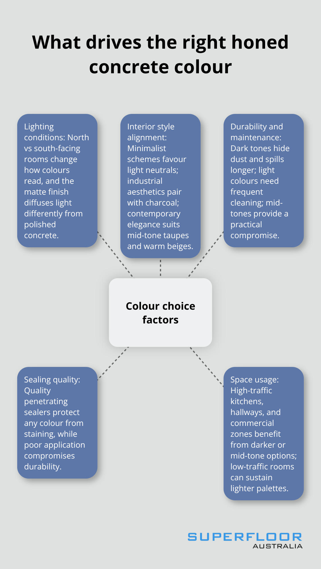
Lighting conditions in your space shift how honed concrete colours appear far more dramatically than most homeowners expect. A colour that looks soft and neutral in a north-facing room with consistent daylight can appear cold and grey in a south-facing space with minimal natural light. The matte finish of honed concrete doesn’t reflect light uniformly like polished finishes do, which means artificial lighting sources become critical to how the colour reads.
Warm white globes around 2700K enhance beige and taupe tones, making them feel more inviting, while cool white lighting at 4000K or higher pushes the same colours toward grey, potentially making them feel sterile. Visit the space at different times of day and observe how morning, midday, and evening light interact with your chosen sample before finalising your colour selection.
Matching Honed Concrete with Interior Design Styles
Interior design styles impose real constraints on colour choices that go beyond aesthetic preference. Minimalist spaces demand light neutrals because the design philosophy relies on simplicity and visual breathing room, so Architectural White or pale greys become foundational requirements rather than optional extras. Industrial aesthetics specifically pair with charcoal and dark grey because these colours reinforce the raw, unrefined character that defines the style.
Contemporary elegance works across the entire spectrum but pairs most successfully with mid-tone taupes and warm beiges that feel sophisticated without appearing cold or clinical. Test your chosen colour against your actual interior materials-whether timber cabinetry, stone benchtops, or wall paint-to avoid the common mistake of treating colour choice as independent from your overall design intent.
Durability and Stain Resistance of Different Colour Options
Durability differences between colour options matter far more in high-traffic zones than most people realise. Dark colours genuinely hide dust, footprints, and minor spills for longer periods, making them objectively superior for kitchens, hallways, and commercial spaces where you want maximum time between deep cleans. Light colours demand weekly sweeping and regular mopping to maintain appearance, a commitment that works only if you’re willing to sustain it.
Mid-tone colours like taupe and warm beige offer genuine compromise, masking general wear while requiring less obsessive maintenance than whites. Stain resistance varies less by colour than by sealing quality-your choice of sealant matters as much as the colour itself. Quality penetrating sealers applied correctly protect any colour option from permanent staining, but a poorly applied or cheap sealer compromises durability across all colour families.
Select your colour based on lighting and style compatibility first, then invest in professional sealing to guarantee the stain resistance you need regardless of which colour family you’ve chosen. This foundation of colour and protection sets the stage for understanding how your honed concrete performs across different spaces and applications.

Honed Concrete Colour Trends in Residential and Commercial Spaces
Why Neutral and Earth Tones Now Dominate Specifications
Neutral and earth-tone palettes have moved from trend territory into standard practice, but not because designers suddenly decided to play it safe. Commercial projects across Australia now specify warm greys, soft taupes, and muted beiges at significantly higher rates than five years ago, primarily because these colours perform consistently across varying lighting conditions and complement both modern and transitional design languages. What makes this shift different from previous cycles is that it’s not driven by aesthetics alone-it’s driven by maintenance reality. Building managers and facility operators discovered that mid-tone honed concrete reduces cleaning frequency while maintaining a professional appearance, directly lowering operational costs.
Schools and shopping centres across Australia have gravitated toward these palettes specifically because a taupe or warm grey floor looks acceptable for three weeks between deep cleans, whereas lighter options demand weekly attention and darker options can absorb excessive heat in outdoor commercial settings. This isn’t preference-it’s economics. The practical outcome is that neutrals and earth tones now dominate specification sheets from architects and builders because they solve real problems rather than simply looking contemporary.
The Seamless Flooring Movement Across Multiple Spaces
Seamless flooring has become a genuine design priority rather than a luxury consideration, and honed concrete’s matte finish makes it uniquely suited to this application. When kitchens, living areas, and hallways flow with the same honed colour, the space feels larger and more cohesive than when different flooring materials create visual breaks between zones. Clients increasingly request the same honed finish and colour across multiple rooms rather than mixing materials, because the cost difference is minimal while the design impact is substantial.
Managing Material Transitions Successfully
The integration challenge emerges when honed concrete meets timber, stone, or tile in the same home. Successful transitions require treating the junction as a design feature rather than a compromise: a timber threshold in matching stain tones, a stone step that echoes the concrete’s warmth, or a subtle colour shift that acknowledges the material change rather than hiding it. The worst approach is attempting to camouflage the transition with mismatched colours that draw attention to the break instead.
Test how your chosen honed colour interacts with adjacent materials under your site’s actual lighting before finalising specifications, because a taupe honed concrete that harmonises beautifully with blonde timber can clash noticeably with darker oak or jarrah. This integration decision shapes whether your flooring reads as a unified design statement or as disconnected surfaces that happen to occupy the same home.
Final Thoughts
Selecting the right honed concrete colours requires you to balance three practical realities: how light moves through your space, how the colour performs under your actual maintenance schedule, and whether it harmonises with your interior materials. Light greys and whites demand commitment to regular cleaning but maximise perceived space, while dark charcoals hide wear brilliantly in high-traffic zones yet absorb heat outdoors. Mid-tone taupes and warm beiges offer genuine compromise, masking daily wear while requiring less obsessive maintenance than lighter options.

The trend toward neutral and earth-tone palettes reflects economic reality rather than aesthetic preference. Building managers across Australia have discovered that mid-tone honed concrete colours reduce cleaning frequency while maintaining professional appearance, directly lowering operational costs. This shift means your colour choice aligns with what’s proven to work in real commercial environments, not just what looks good in showrooms.
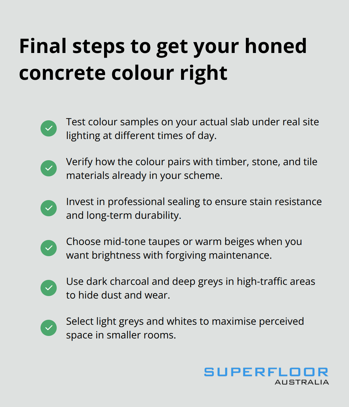
Test samples on your actual concrete under your site’s real lighting at different times of day before you commit to any colour. Verify how the colour pairs with your timber, stone, or tile materials, and invest in quality sealing-a poorly applied sealant compromises durability regardless of which honed concrete colour you’ve chosen. Contact Superfloor Australia to discuss your project, test colours in your space, and move forward with confidence.
