
Polished concrete colours transform industrial spaces into stunning design statements. At superfloor australia, we’ve seen firsthand how the right finish can completely change a room’s character and functionality.
Your colour choice matters more than you might think. Lighting, style, and practical durability all play a role in finding the perfect match for your space.
The Colours That Work Best in Real Spaces
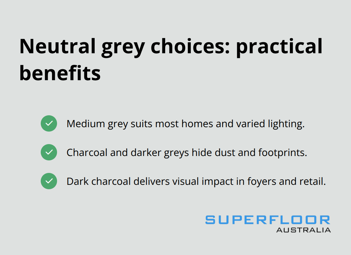
Neutral Greys: The Practical Choice
Neutral greys dominate polished concrete installations across Australia for solid reasons. These shades brighten interiors without the maintenance burden that lighter finishes demand, while charcoals and darker greys hide dust and footprints in high-traffic commercial spaces. Medium grey works well for most residential projects because it photographs well, performs under varied lighting conditions, and won’t expose every speck of dust like pale grey would. Dark charcoal performs exceptionally well in office foyers and retail environments where visual impact matters more than constant cleaning schedules.
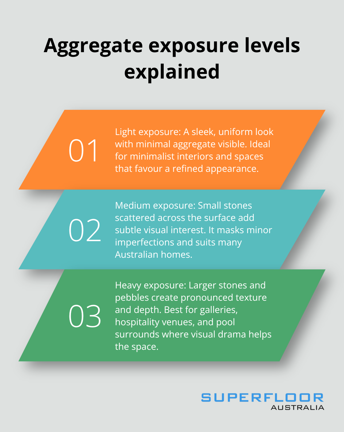
The key difference between these neutrals comes down to aggregate exposure. Light exposure creates a sleek, uniform look ideal for minimalist interiors, while medium exposure adds subtle texture that masks minor imperfections over time.
Warm Earth Tones for Residential Spaces
Warm earth tones like beige and taupe gain real traction in residential settings, particularly in sunrooms and kitchens where natural light hits the floor throughout the day. Terracotta and amber tones perform well in outdoor areas and pool surrounds because they maintain visual warmth even under harsh Australian sun. These colours work best when you test actual samples under your specific lighting conditions, as polishing can involve sealer application that may alter the concrete’s appearance.
Dark Finishes and Their Demands
Deep blues, forest greens, and bold reds suit industrial spaces, modern galleries, and high-end commercial projects where dramatic contrast matters more than practicality. However, black concrete requires aggressive maintenance schedules-water marks and dust become instantly visible, making it unsuitable for busy households with children or pets. The honed finish at a P3 or P4 slip rating works better than polished for external applications in warmer climates, as it reduces glare while maintaining colour depth.
Lighting’s Critical Impact on Colour Selection
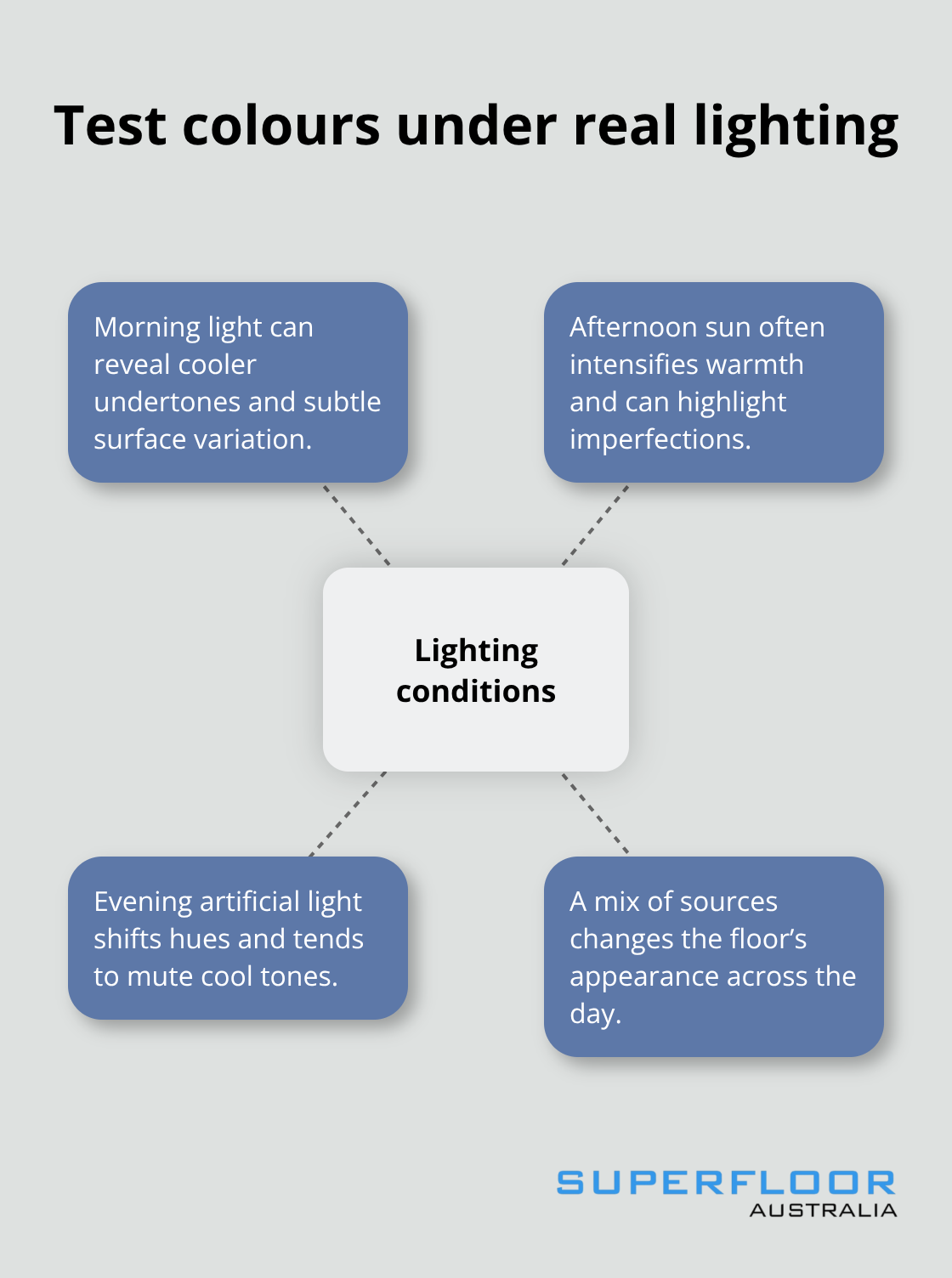
Artificial lighting can alter the appearance of polished concrete compared to natural daylight. This reality means that samples viewed under showroom lights may look completely different once installed in your space. Test your chosen colour under the actual lighting conditions where the floor will live-morning light, afternoon sun, and artificial evening light all reveal different aspects of the same finish. This step separates successful colour choices from disappointing installations.
Your colour selection directly influences how the next design layer-matching your finish to your interior style-will ultimately perform in your space.
Design Considerations When Choosing Polished Concrete Colours
How Lighting Transforms Colour Perception
Warm artificial lighting in offices and homes mutes cool tones like deep blues and forest greens, making them appear dull and lifeless compared to how they looked under showroom fluorescents. Natural daylight enhances warm earth tones and can intensify darker finishes to the point where black concrete becomes nearly impossible to maintain due to water marks and dust visibility. Lighting transforms colour perception; direct sunlight produces a different appearance to indirect light, and indoor lighting can vary in intensity and colour temperature.
Test samples for a minimum of three days under your actual lighting conditions-morning light, afternoon sun if applicable, and artificial evening lighting all reveal different colour personalities. Polished concrete darkens slightly after sealing, so account for this shift when you evaluate samples. This testing phase isn’t optional; it’s the only way to avoid expensive regret.
Matching Colours to Your Interior Design Style
Your interior design style should dictate colour selection rather than the reverse, and this means acknowledging that trendy colours often clash with existing elements. Medium grey works across residential and commercial spaces because it pairs with virtually any design aesthetic, from minimalist to traditional, without demanding attention. When matching colours to interior design style, consider factors such as the overall design theme, lighting, and the desired ambiance.
Industrial spaces with exposed brick or steel elements perform better with charcoal or deep tones that create visual harmony rather than contrast. Your chosen colour either enhances or fights against what already exists in the room-there’s no neutral middle ground.
Durability and Maintenance Demands by Colour
Lighter finishes expose dust, footprints, and water marks within hours, demanding weekly cleaning in high-traffic areas. Darker shades hide imperfections but show sealer residue and require different maintenance approaches. Durability and maintenance demands vary by colour; the high-gloss finish contributes to durability while also offering easy maintenance benefits.
Stain resistance depends more on sealer quality than colour choice itself, though darker finishes psychologically appear more forgiving because discolouration blends into the base tone. Your lifestyle and cleaning tolerance should influence this decision as much as aesthetics do.
The Practical Reality of Colour Performance
What works in a showroom rarely translates directly to your home or commercial space without adjustment. Water marks, dust visibility, and sealer application all shift how your chosen colour actually performs once installed. The gap between expectation and reality widens when you skip the sample testing phase or ignore how your specific lighting conditions interact with the finish you’ve selected.
Understanding these practical realities positions you to make decisions that stick-literally and figuratively. Next, we’ll explore how customisation techniques let you move beyond standard colour options and create something truly distinctive for your space.
Customisation Options and Techniques for Polished Concrete
Aggregate Exposure Creates Visual Impact
Aggregate exposure fundamentally changes how your polished concrete floor reads visually, and this single decision determines whether your finish looks sleek and minimalist or textured and dynamic. Aggregate exposure creates visual variety ranging from a smooth, uniform finish with the aggregate fully concealed to tiny flecks of aggregate peeking through the surface. Medium exposure reveals small stones and aggregates scattered across the surface, adding subtle visual interest without overwhelming the eye-this sits as the sweet spot for most residential installations because it hides minor imperfections while maintaining a refined appearance. Heavy exposure showcases larger stones and pebbles throughout the floor, creating pronounced texture and depth that demands attention, and this approach works exceptionally well in commercial galleries, hospitality venues, and outdoor pool surrounds where visual drama serves the space’s purpose.
Your colour and texture decisions must happen together, not sequentially. A light grey with heavy exposure looks completely different from the same grey with light exposure, so the choice of aggregate exposure interacts directly with your chosen colour.
Dyes and Stains Expand Your Colour Range
Dyes and stains offer the fastest path to colours beyond what integral pigmentation alone delivers, and this matters when your concrete base colour doesn’t align with your design vision. Acid stains produce marbled, variegated effects that create depth and character, though the final appearance varies naturally based on concrete composition-you cannot achieve uniform colour across multiple installations, but this variability becomes a design feature rather than a flaw if you embrace it. Dyes provide vibrant hues with more predictable results than acid stains, typically applied after initial grinding at rates around 400 to 600 square feet per gallon, with multiple coats possible for deeper colour intensity. These work particularly well when you want bold colours that integral colouring struggles to deliver.
Professional execution prevents blotchy results or uneven colour distribution, so this isn’t a DIY project for most homeowners. Combining approaches-applying integral pigment as your base colour, then adding dyes or stains for accents or enhancement-gives you control that single-method applications cannot match.
Overlays Recolor Existing Concrete
Overlays represent another customisation avenue, allowing you to recolour pre-existing concrete without full replacement, and these extend floor life by adding a protective layer while delivering customisable finishes from matte to high gloss. The overlay process involves surface preparation through light grinding and pressure washing, degreasing with appropriate cleaners, repairing cracks with epoxy repair kits, then priming with diluted polymer before applying base and top coats at approximately 4 kilograms per square metre each.
Creating multi-coloured effects through overlays means applying contrasting colours at roughly 15 percent coverage on top coats or choosing alternate textures that create visual complexity without looking chaotic. This technique performs well in retail environments and hospitality spaces where visual interest drives customer engagement.
Final Thoughts
Test your chosen polished concrete colour under actual lighting conditions for several days before committing to installation, as showroom samples reveal nothing about how your space’s morning light, afternoon sun, or artificial evening lighting will interact with the finish. Durability and maintenance demands vary significantly by colour; lighter shades expose dust and water marks within hours, while darker finishes hide imperfections but require different cleaning approaches. Match your colour selection to your existing interior design style rather than forcing trendy colours into spaces where they clash with what already exists.
Professional installation matters because colour consistency depends on precise surface preparation, proper sealer application, and technique that prevents blotchy results or uneven distribution. The gap between expectation and reality widens dramatically when installation quality falters. Surface preparation errors compound throughout the polishing process, making expert execution non-negotiable for polished concrete colours that perform as intended.
We at Superfloor Australia understand that polished concrete flooring demands precision preparation and expert craftsmanship to deliver lasting results tailored to your specific needs. Your colour choice represents an investment in your space’s character and functionality-getting it right from the start costs less than correcting mistakes later. Contact us to discuss how we can help you select and install the perfect finish for your project.